TL;DR
- Client: VaVaVape
- Project Type: Print
- Technologies: Illustrator, Versaworks
Project Overview
The manager of VaVaVape came to me requesting three posters that could be hung on the wall in the stores. He needed a them to help fill one of the walls that had been opened up after rearranging the store layout. When it came to specific requests, he needed one of them to address safety concerns for batteries, but otherwise, the project was open for me to decide on what to design.
Design Time
When it came time to design the posters, I knew I wanted something punchy when it came to color. Vava's main color is a bright magenta, so it only made sense that it be a background color. In order to keep all the posters from looking similar, I decided to switch up the background colors on the other two posters. So I used a bright blue and a yellow.
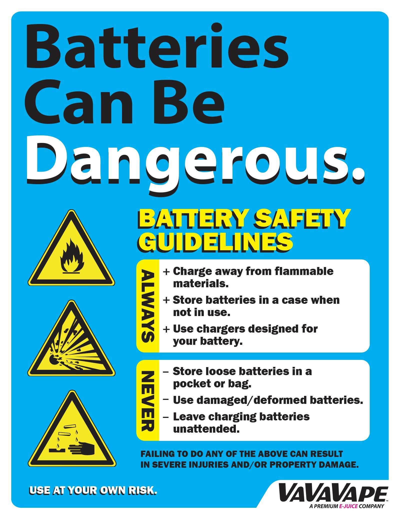
I started with the battery safety poster. The information on it had already been collected, as we had made handouts for customers previously. It was just a matter of reformatting it to fit the much larger size. I tried to keep the heading as large as possible, hoping to grab the customers attention as they were standing at the counter. This was also the thought behind adding the caution icons.
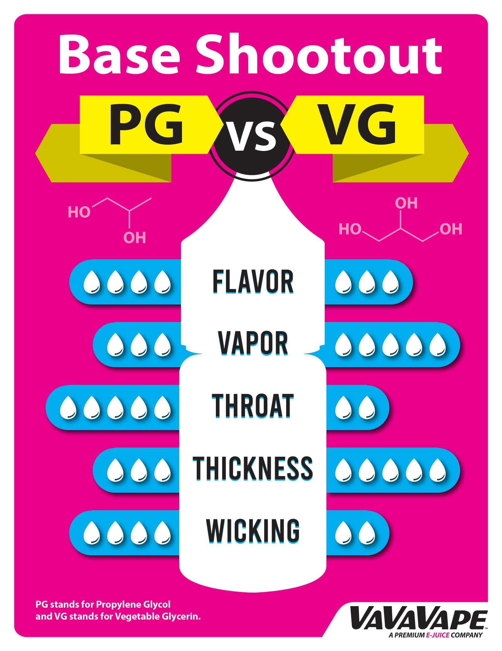
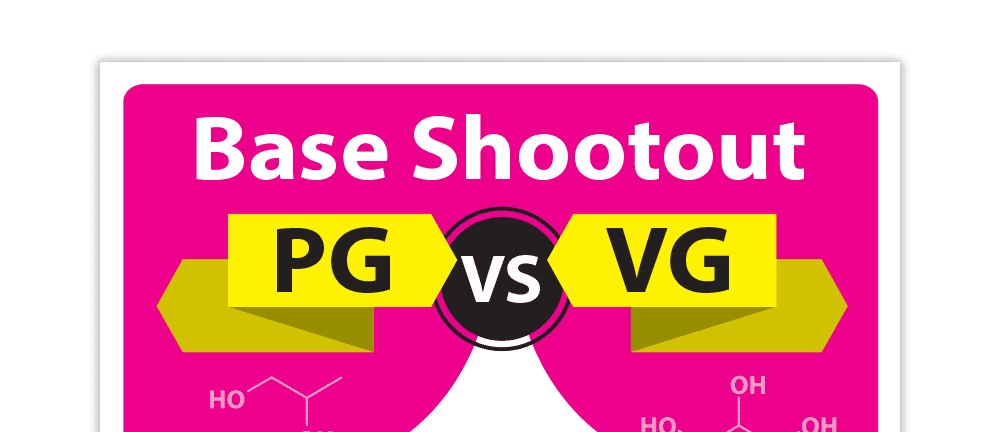
The second poster was the base shootout. Those unfamiliar with vaping, the base being referred to here is referring to the actual base ingredients in the eliquid juice being vaporized by an electronic cigarette. There are two primary base ingredients, propylene glycol and vegetable glycerine and each have their own distinctive properties. The difference between the two is something the employees are constantly asked. So I thought a infographic style poster could help illustrate the answer.
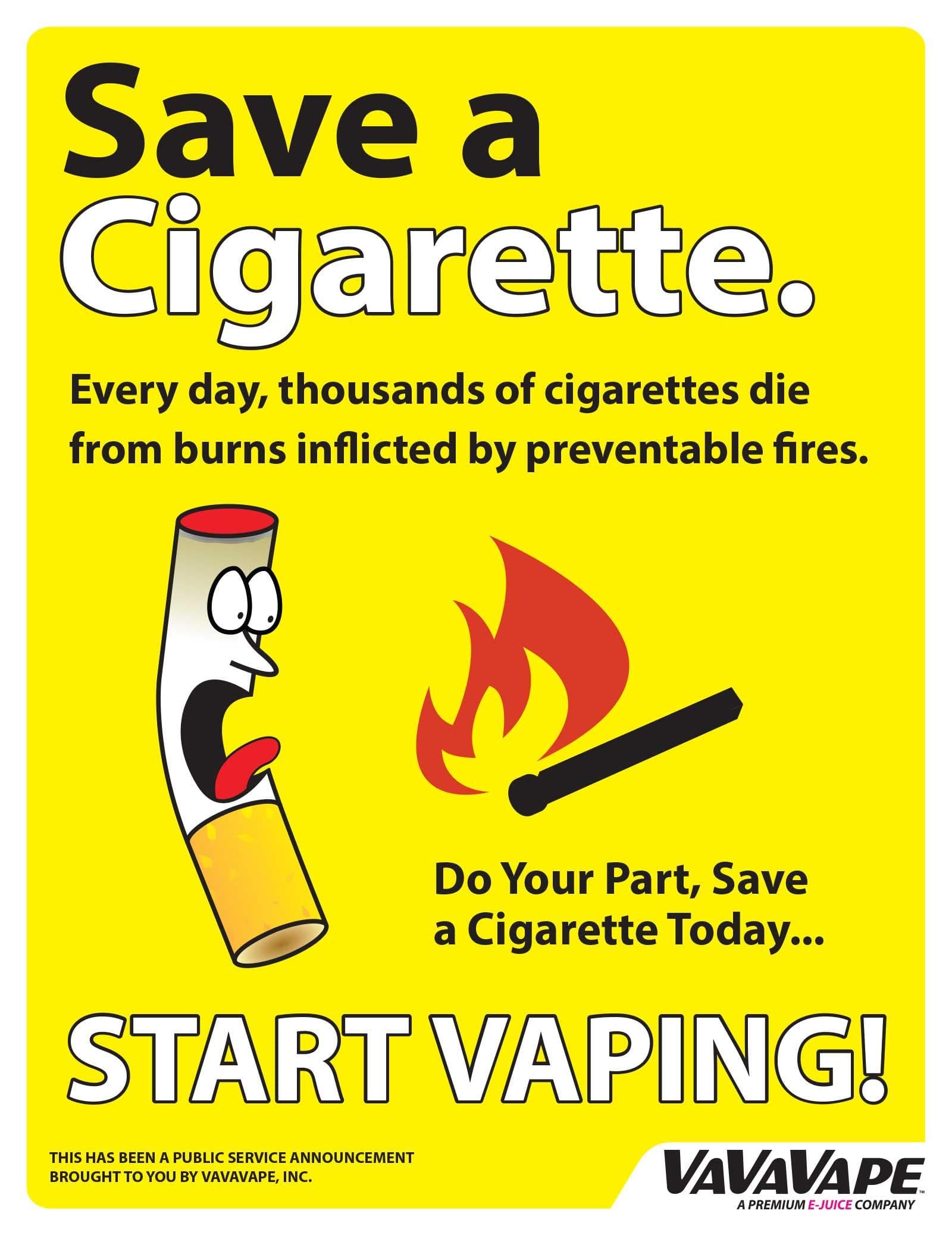
The final poster isn't something I can take full credit for. The saying and the base idea of the artwork were found online one day, not in context with the poster design. However, when thinking of what to do on the third poster, I remembered it and thought it would be funny. I didn't like the original cigarette character, so I redrew it. I'm pretty sure it was just a piece of clipart originally. I pulled it together by trying to format the poster similar to the other posters created.
Printing
One of the coolest toys I get to play with at work is the Roland wide format printer. Capable of printing weather resistant prints up to 54" wide with the ability to contour cut as well. This printer and those similar to it are primarily used in the sign industry. For the poster designs, I printed each on a 20"x30" sheet of white, adhesive backed vinyl. A total of 12 posters were printed; four copies of three different posters. One set per store location.
While the posters were printing, I prepared the backing boards for the prints, which were cut out of foam-board. These help provide rigidity to the prints, making hanging them on the wall a lot easier. Once I had all the prints completed and the foam-boards cut down, I applied each sheet of vinyl to the foam-board. The finished posters were delivered to the manager who distributed them to each of the locations.
The Results
At the end of the project, after they were hanging up in the stores, everyone involved was pleased with the end results. We later adapted the posters to smaller formats including flyers and smaller posters. If I were to change anything, I would have mounted them differently. Foam board isn't great and can be damaged really easy. So putting them on something a bit more robust would have benefited the final product. Though depending on the material, could have driven the cost up.