TL;DR
- Client: VaVaVape (unsolicited)
- Project Type: Web App
- Technologies: Laravel, TailwindCSS, Vue
- URL: IlModulo.xyz (not live)
Project Overview
This project is a bit different then all the others I have shown on my site. This one isn't complete, but I feel it shows a progression in the way I think and work.
If you aren't aware, Il Modulo is a Laravel based app that I created for Vavavape. The primary goal of the app was to learn how to develop in Laravel and a side bonus would be to help eliminate some of the pains related to keeping 'America's Fastest Growing EJuice Company' moving. If you read the post to the end, then you are aware no one used the first version. Which begs the question, why make a version 2?
I give the same two 'main' reasons. Learning and an easier employee experience. The difference being this time around I want to change things up. Make the app more robust in functionality, eliminate some of the pain points from the original version and take a little more time with the initial process of planning out the project. To add a bit more on to it, I also want to alter my tech stack and use TailwindCSS and Vue.js.

Roughing It In
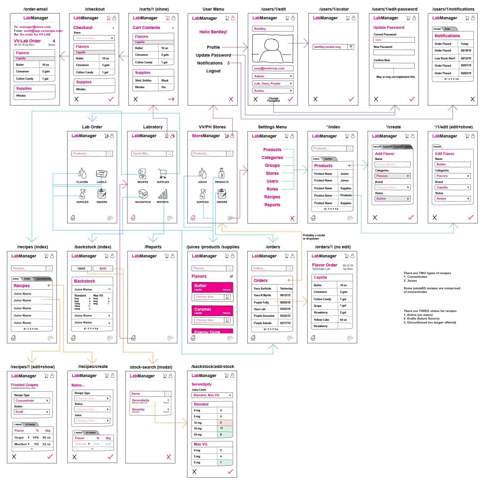
The first place I started, was my favorite place, Illustrator! Perhaps, not the most web centric app out there, but it's the app I feel the most comfortable in. It's my go to when I want to put something together fast. So, that's exactly what I did. I created a huge canvas, grabbed the pencil tool and started 'drawing' as if I were using a pen and paper. Of course I used rectangles and did a lot of copying and pasting.
I illustrated most if not all the major pages that would be on the app and I added color coded lines showing common flows that the user might take through the app. I wasn't focusing on the design too much. It was a thought, but the primary goal was more to work out the flow and general structure of the app. I would later take this rough idea and refine it in Sketch, where those lines came in handy.

Refining the Design
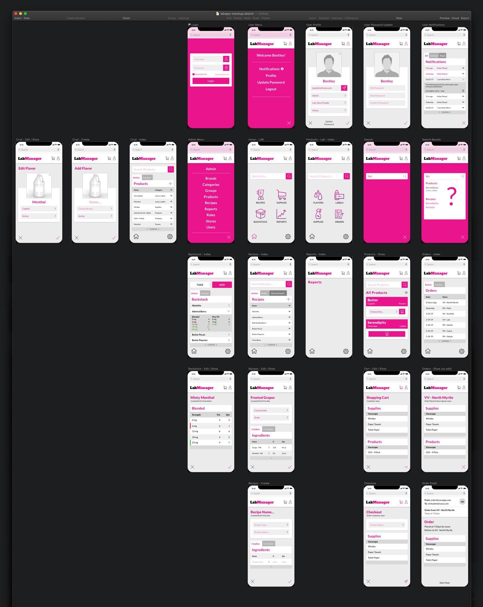
I'm not going to lie, this next part came about because there was a cool new thing to play around with. Everywhere I looked, at the time, people were raving about this program called Sketch. I don't recall hearing a bad word about it, only high praise around the web. So of course I had to check it out. From what I could tell, it seemed pretty neat and the features the highlighted on their site sounded awesome. I downloaded the free trial and started tinkering around then thought... I have the perfect thing to work on!
A couple short youtube videos later and I was off to the races refining this and refining that. How freaking amazing. To say I was impressed with Sketch would be an understatement. This isn't an ad for Sketch, but I did realize what all the buzz was about. What I was able to come up with, in such a short time frame, with such a small learning curve was amazing. Top it off with I had something I could easily share with coworkers that would allow them to click through the app. I'm sold.
One aspect of the design that I refined outside of Sketch was the icons. My idea required some, let's so, not ordinary icons. I realize there are icons for nearly everything out there, but finding all of the ones I needed that had the same feel or look proved to be difficult. So I started with Steve Schoger's free icon set and for what I didn't find there, I turned to trusty ol' Illustrator. The original mockup I did in Illustrator had some hand drawn icons I made, but they weren't that great and I wanted them to look a little better then what I quickly sketched up with the pencil tool. Below shows the full set
![]()
The Next Step
Sadly this is where the project has stopped. According to the file dates, that was about seven months ago, as of writing this. With this being a side project and something no one really asked me for, its hard to find time for it at work. Factor that in with the fact I have been working on other, more pressing side projects when at home and, well, I end up with a 'dusty' folder of project files.
This project isn't dead. I do plan to continue on with it. There is a lot of learning to be had by completing the project and I find it a lot easier to work on this as opposed to some random to do app or something similar. As I mentioned at the beginning, I plan to use TailwindCSS and Vue.js. Both of which I really enjoy using. I'm not sure how much Vue I want to include. I've thought about going down the laravel api with vue front end route, but I'm not 100% if that's the way I want to. There's also the idea of a progressive web app. So much fun to be had, so little time. Guess we will see.
Thank you for reading.
